.png)
Graphics
Moveday Removals
Creating a modern identity and responsive website for a growing UK removals company, with a focus on building trust, improving the customer experience and supporting online enquiries.
Building a brand designed to move
MoveDay Removals is a UK removals company providing home, office and long-distance moving services. The business needed a stronger visual presence that would communicate professionalism, reliability and approachability in a competitive local market. I was responsible for developing the brand’s visual direction and applying it across the website, digital content and printed marketing materials. The project began by reviewing how the company presented its services and identifying opportunities to make the customer journey clearer.
A consistent system of colours, typography, imagery and graphic elements was then introduced across each touchpoint. The resulting identity gives MoveDay a more recognisable and trustworthy presence while remaining flexible enough to support the company as its services and customer base continue to grow.
Moveday Removals
Moveday Removals
Moveday Removals

Moveday Removals
Moveday Removals
Building a brand designed to move
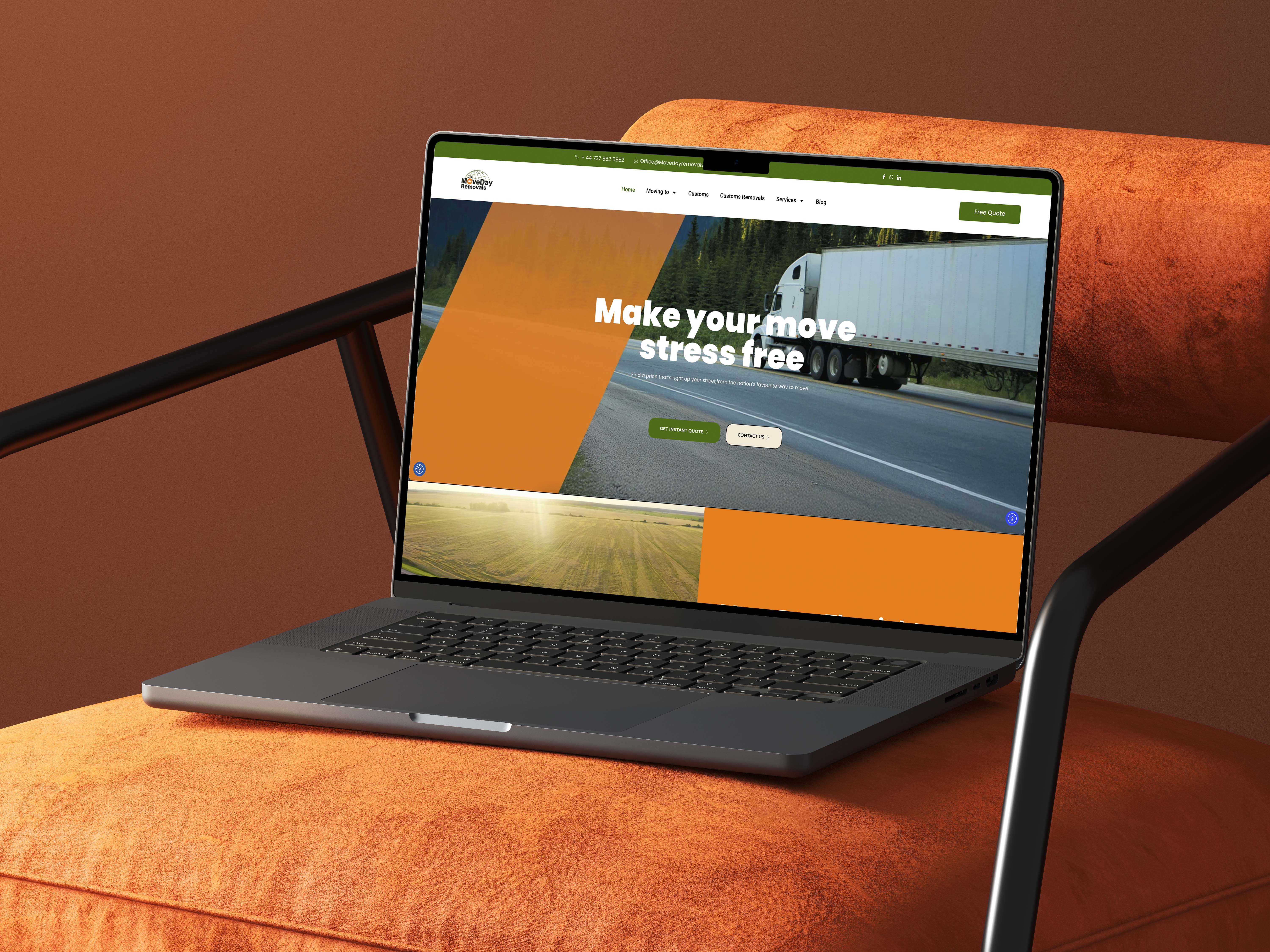
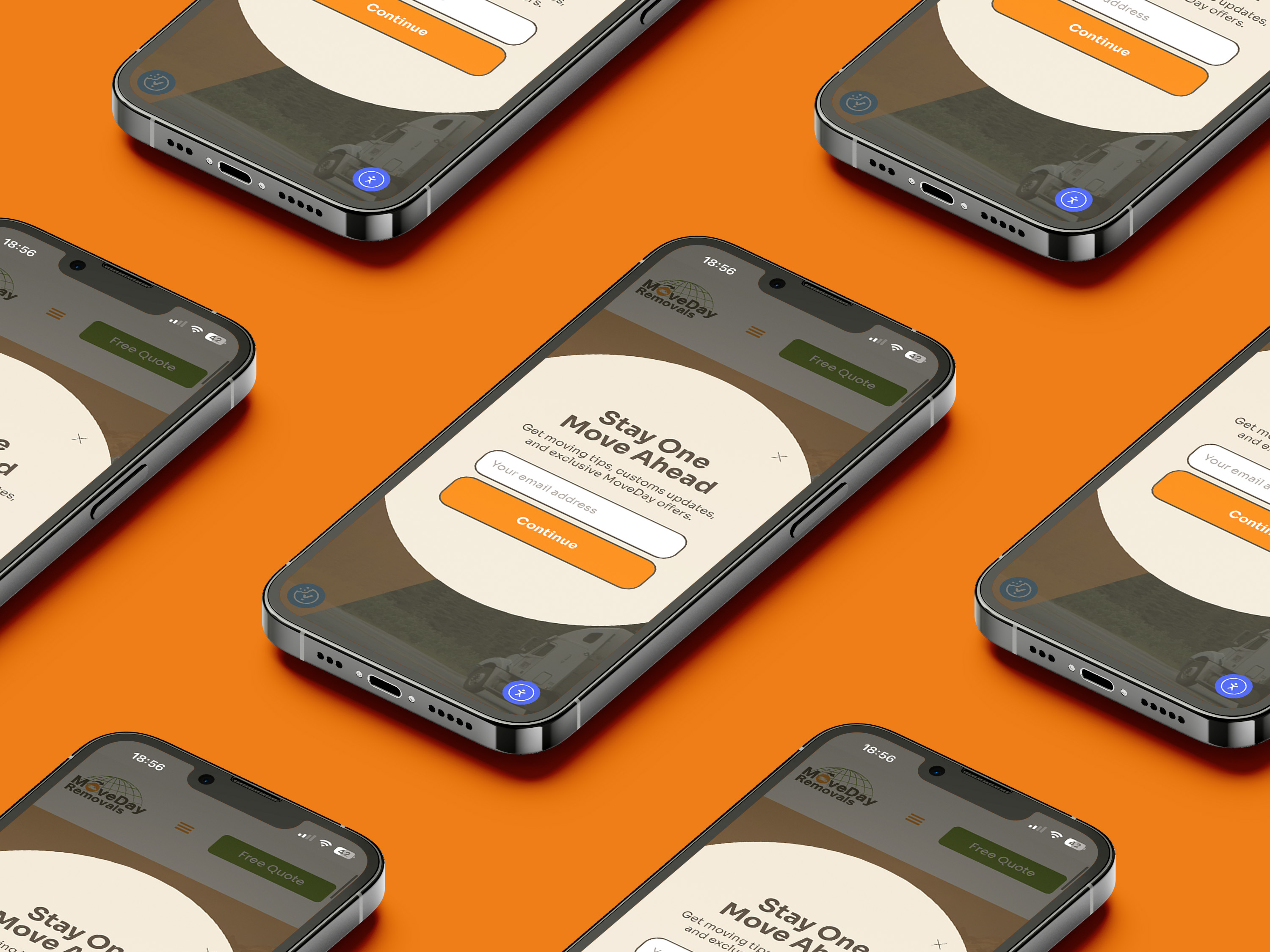
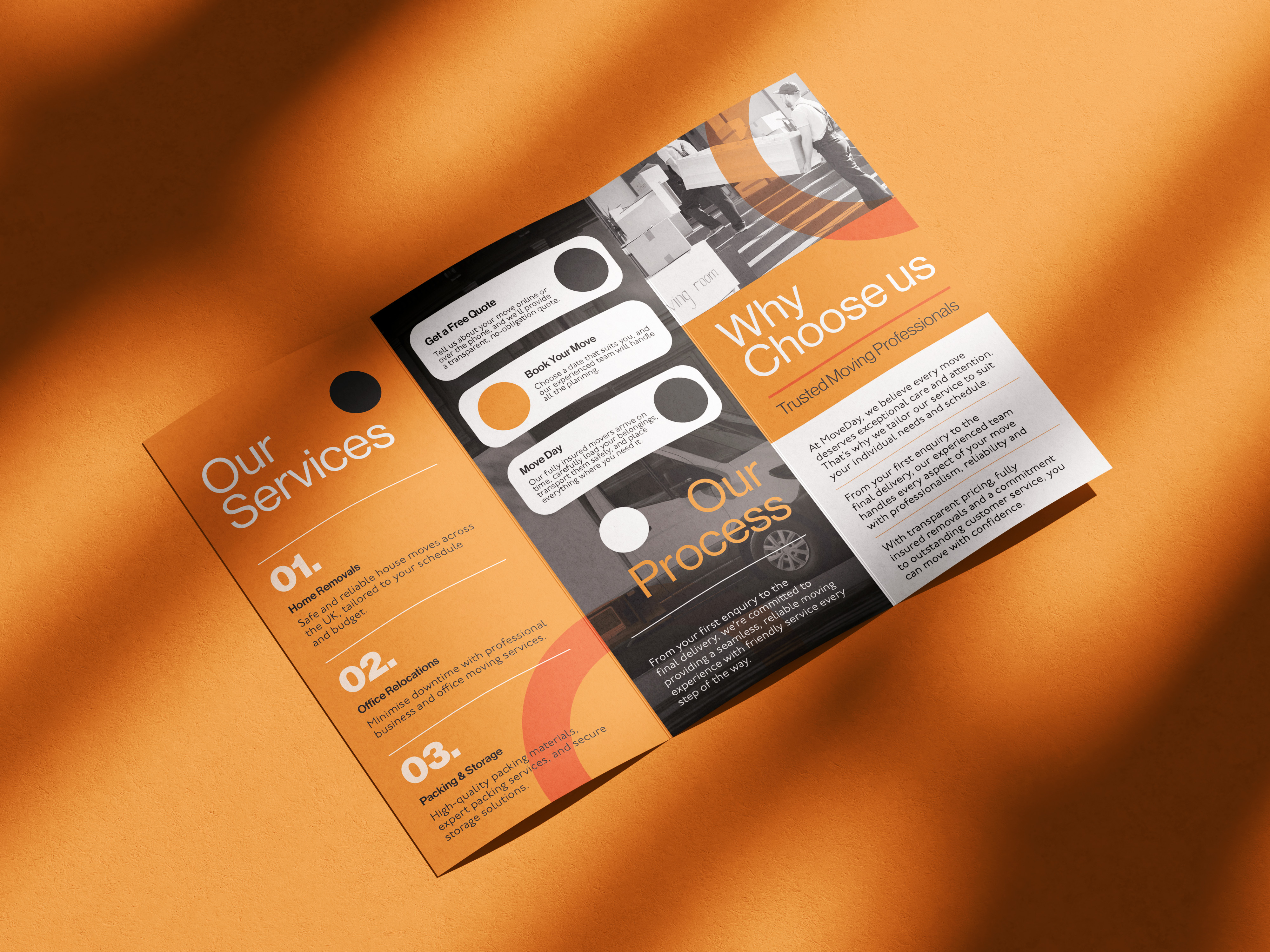
The website was designed around the information customers need when planning a move, from understanding the available services to requesting a quotation. Clear navigation, straightforward messaging and prominent calls to action help users find relevant information without making the process feel complicated. The responsive layout provides a consistent experience across desktop and mobile devices, recognising that many customers search for removal services while using their phones.
Service pages were structured to explain what MoveDay offers while supporting visibility for relevant local searches. Trust-building elements, approachable imagery and a clear content hierarchy help reassure potential customers throughout their journey. The overall experience balances the practical needs of the business with a simple and accessible interface designed to encourage genuine customer enquiries.
Visual Identity & Brand Rollout
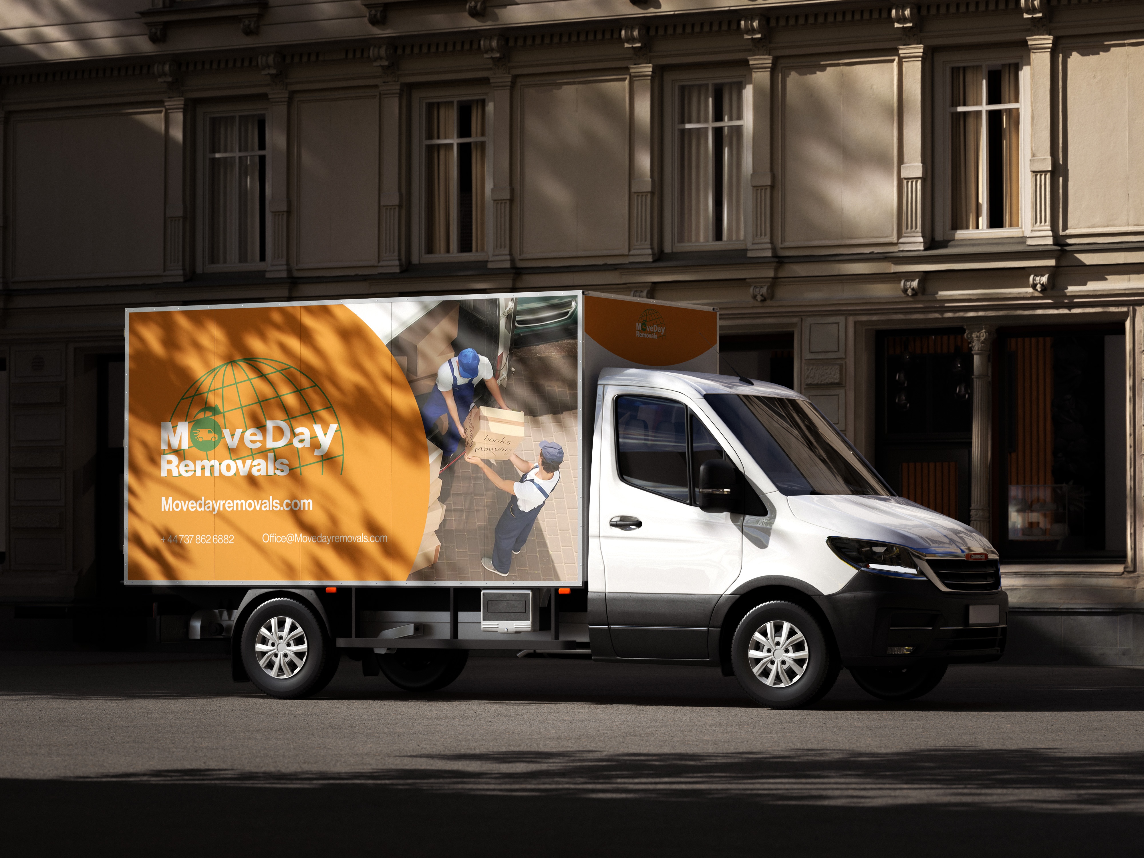
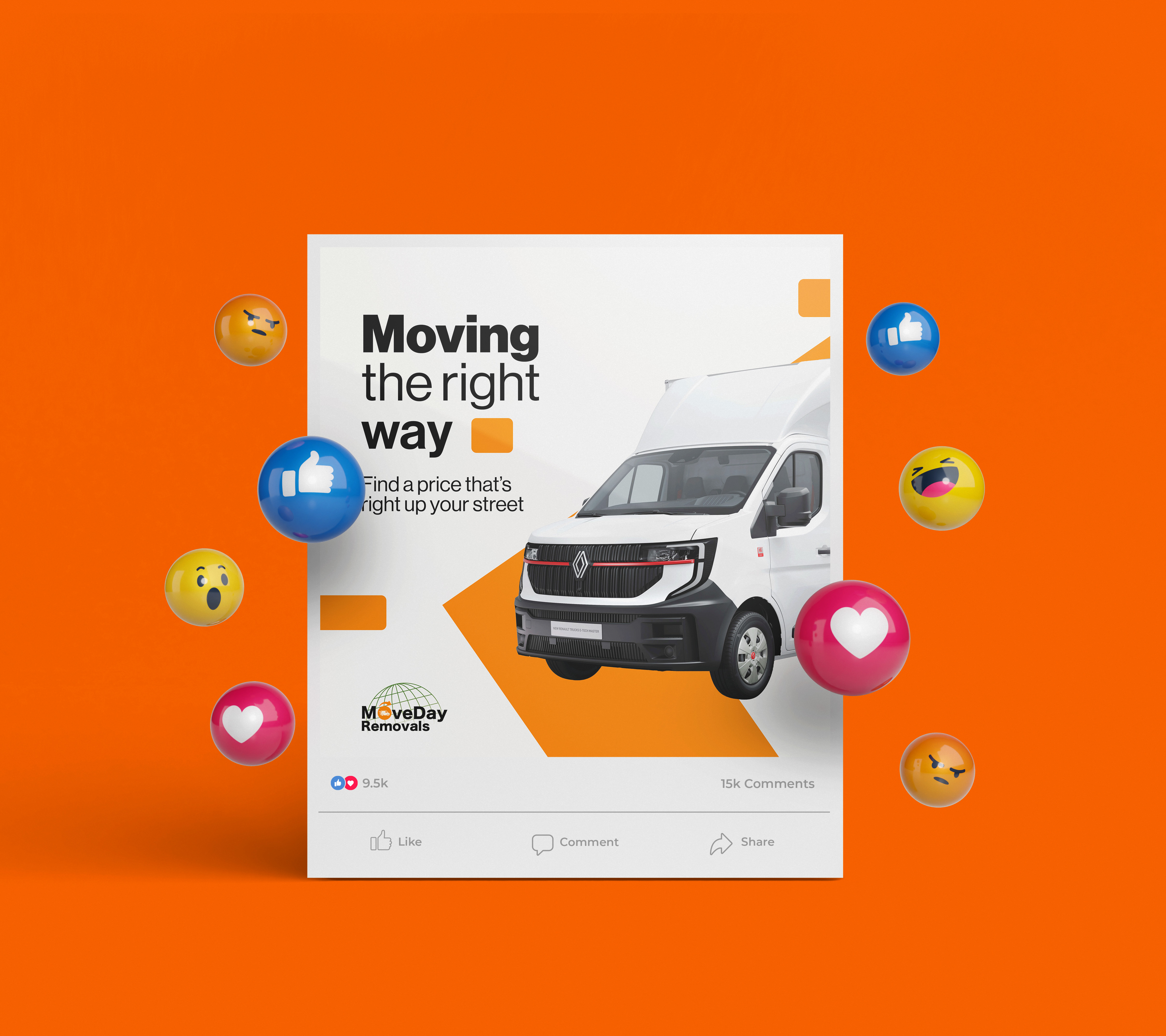
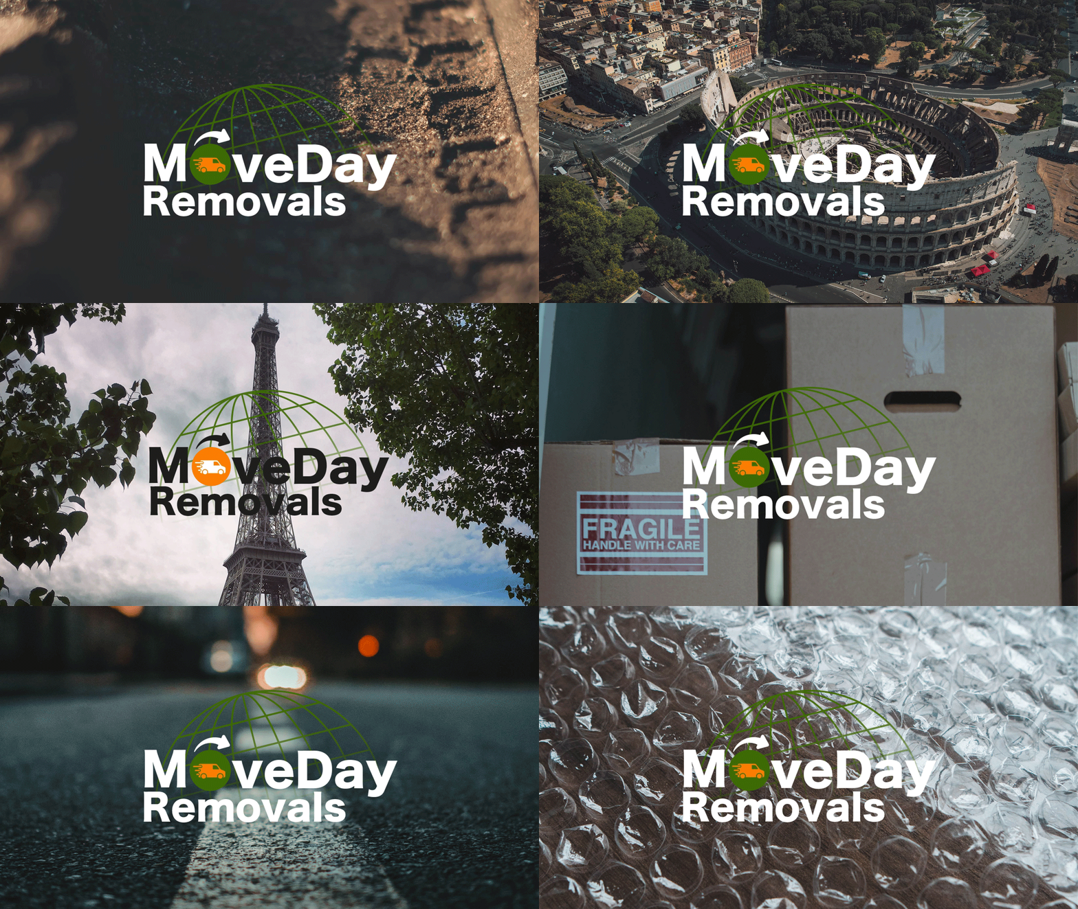
The visual identity uses a bold orange palette to give MoveDay an energetic and recognisable presence, supported by darker tones that communicate professionalism and dependability. The globe and moving-van elements connect the brand with travel, logistics and relocation, while the typography remains clear and confident across different applications. Once the core identity had been established, it was extended across social media content, printed leaflets, staff uniforms and other customer-facing materials.
Each asset was designed to feel consistent without becoming overly repetitive, allowing the brand to adapt to both digital and physical formats. Bringing these touchpoints together created a more unified experience and gave MoveDay a practical visual system that could support future campaigns, services and continued business growth.
.png)
.png)
.png)
.png)