.png)
Graphics
Flow Coffee
A research-led coffee brand concept combining contemporary Japanese-inspired art direction with a bold visual identity, packaging system and environmental applications.
.png)
Concept & Research
Flow Coffee is a self-initiated brand concept inspired by Asia’s evolving relationship with speciality coffee and the region’s often underrepresented role within the wider industry. The project explores the journey of coffee between producer, place and customer, using the idea of “flow” to represent movement, cultural exchange and the ritual of preparing and enjoying coffee.
My research considered contemporary Japanese design, independent café culture, packaging trends and the visual language used by lifestyle-focused food and drink brands. Rather than recreating a traditional aesthetic, I selected individual references that could be translated into a modern and internationally accessible identity. The aim was to create a brand that felt distinctive and culturally considered while remaining flexible enough to work across packaging, merchandise and physical café environments.
Flow Coffee
Flow Coffee
Flow Coffee
Flow Coffee
Flow Coffee
Visual Identity & Art Direction
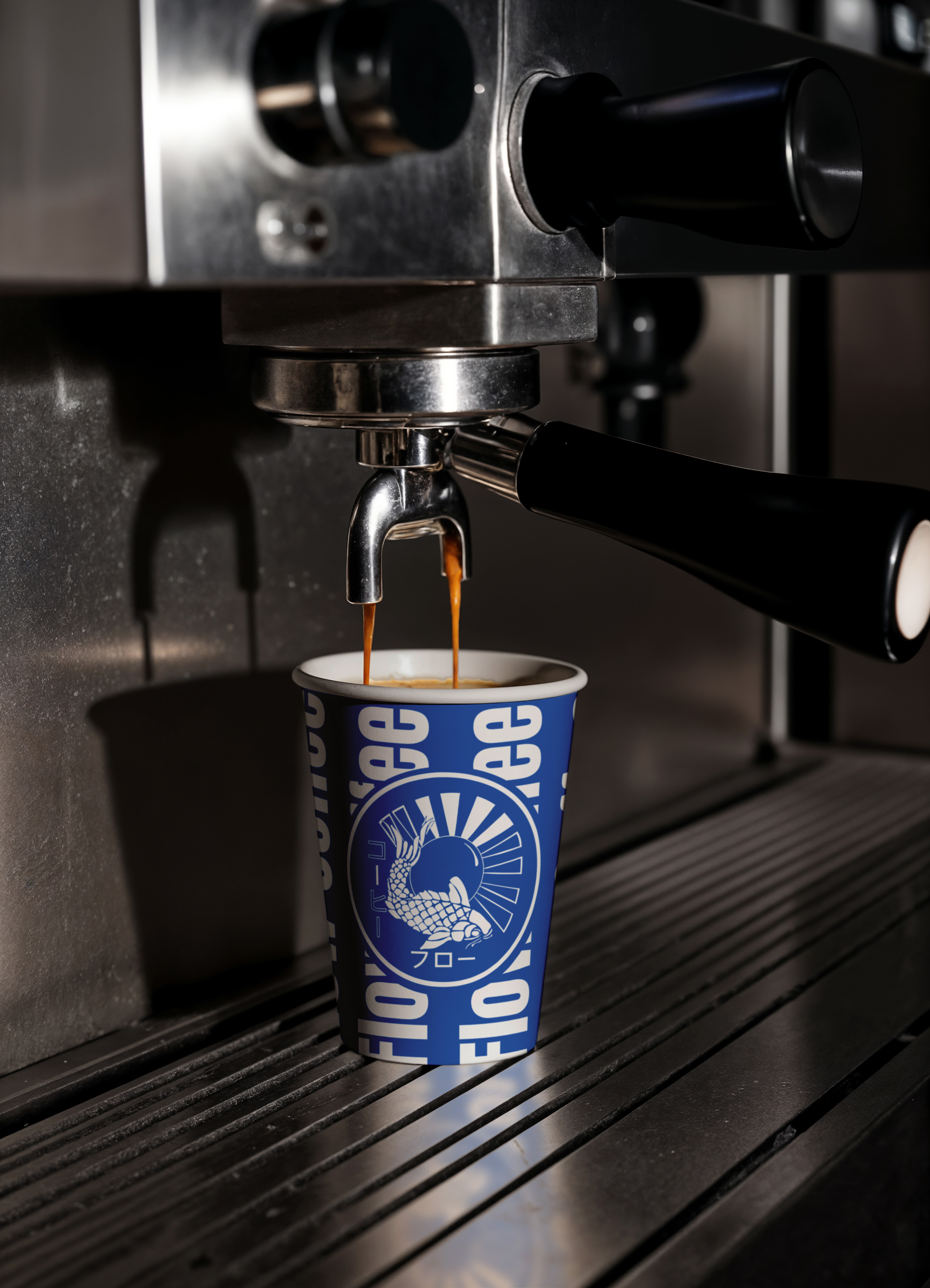
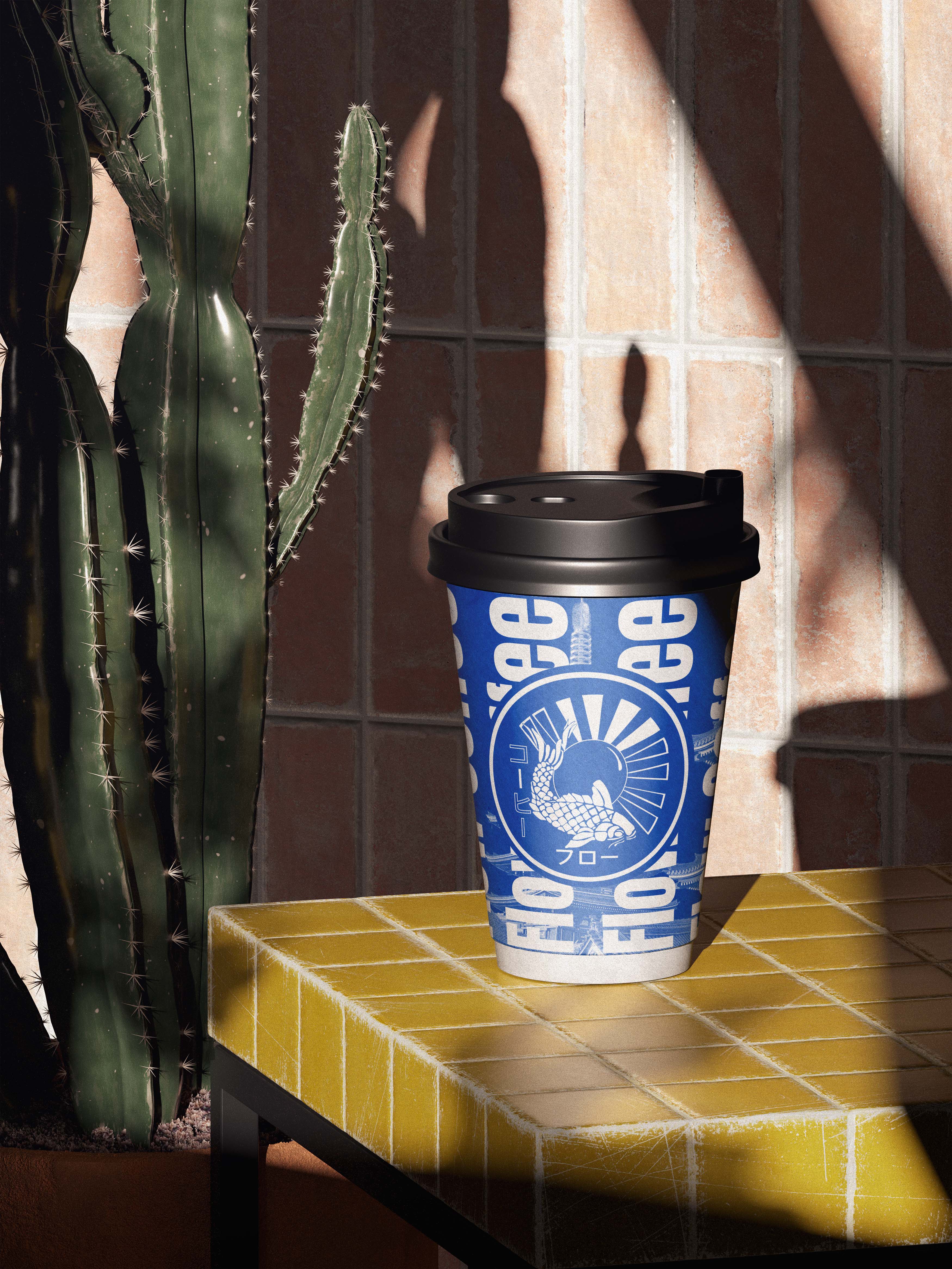
The visual identity combines a detailed crane emblem with bold, condensed typography to create a balance between craft and contemporary expression. The crane was selected to represent movement, longevity and the international journey behind the product, connecting naturally with the Flow Coffee name. A blue and white colour palette provides an unexpected alternative to the earthy tones commonly associated with coffee branding, helping the identity feel fresh and immediately recognisable.
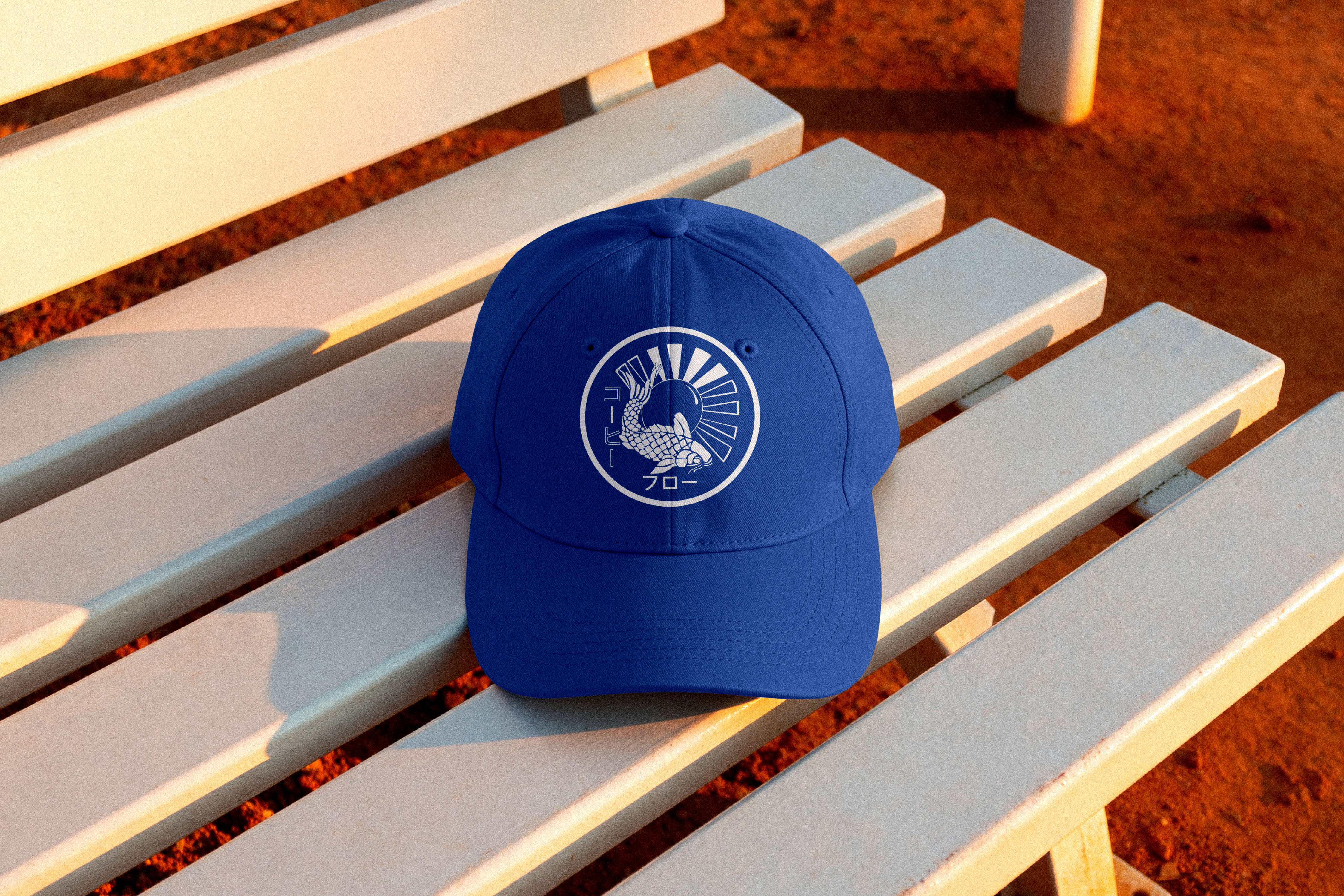
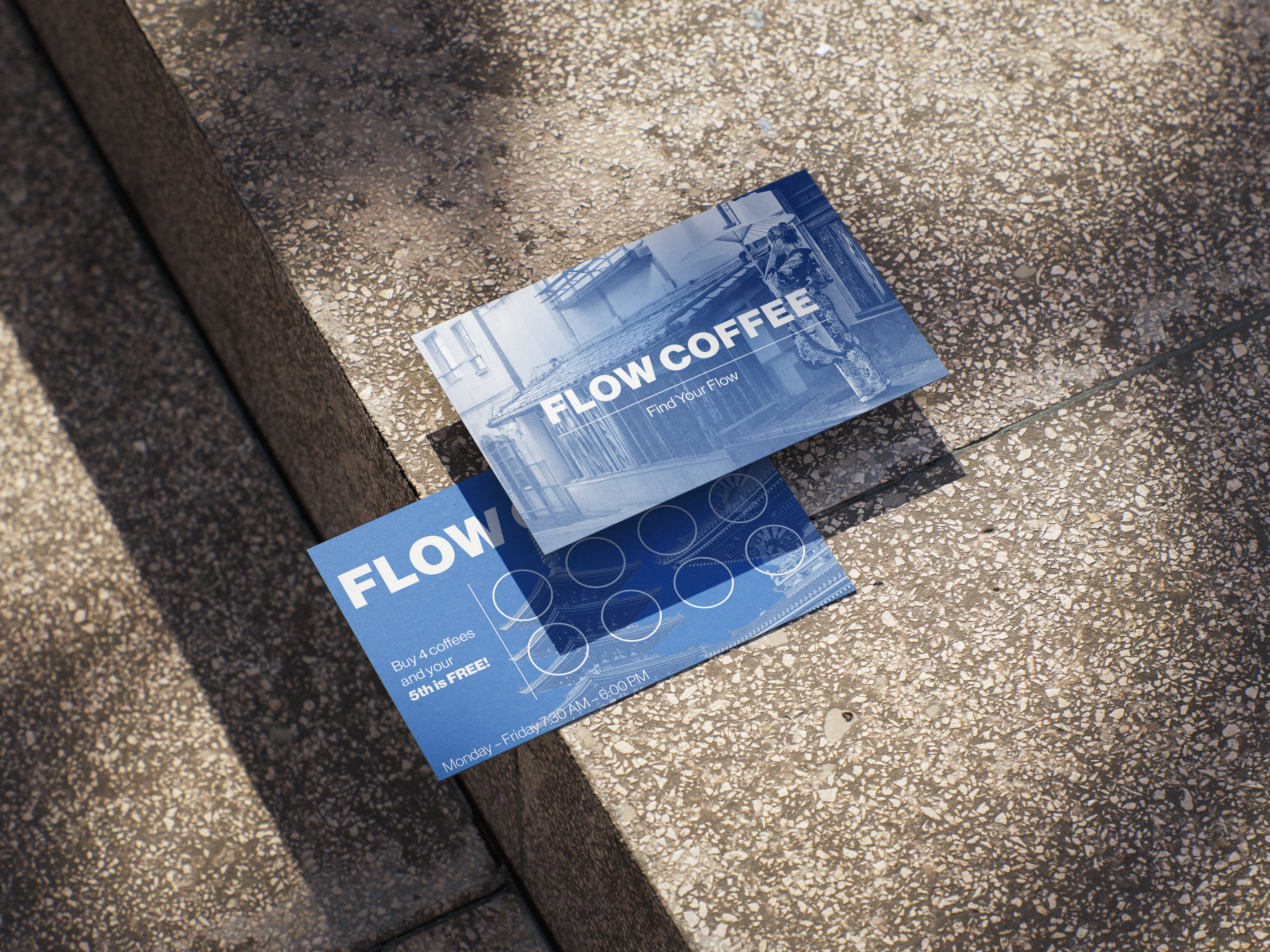
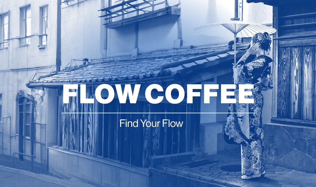
Japanese lettering is incorporated as a supporting graphic element, adding context and visual character without replacing the English-language brand name. The circular logo functions as a flexible stamp across different applications, while repeated typography, architectural photography and layered compositions create a wider visual language that feels energetic, urban and suited to a modern independent coffee brand.
Packaging & Brand Application
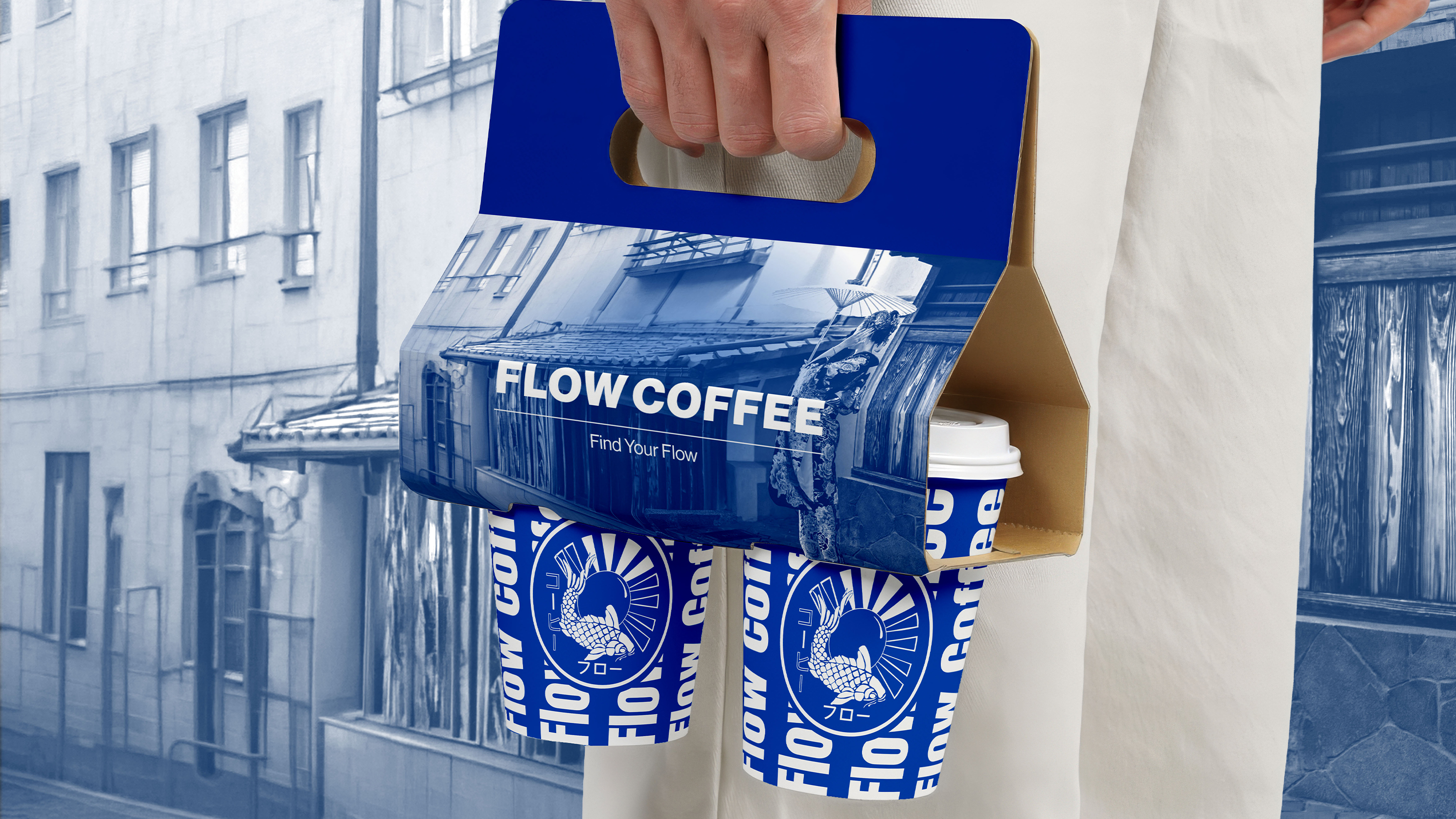
The identity was extended across takeaway cups, coffee carriers, merchandise, signage and promotional materials to demonstrate how Flow Coffee could operate as a complete customer-facing brand. Repeated typography wraps around the cups, creating a bold pattern that remains recognisable from different angles, while the central emblem provides a consistent focal point. The coffee carrier combines architectural photography with typography and colour, transforming a practical item into a memorable part of the customer experience.
Branded clothing and outdoor signage show how the identity could move beyond packaging and become recognisable within a physical café environment. Applying the visual system across multiple touchpoints helped test its flexibility and created a connected brand world rather than a single standalone logo or packaging design.
.png)
.png)
.png)
.png)