.png)
Green Treat
.png)
The Brief
The client aimed to acquire 1,000 new users within the app’s first year, with a strong focus on organic growth via social platforms. Their vision was a platform that users would naturally want to share driven by a clean interface, community-led design, and features that felt personal and useful. Our design goal was to centre the app around real user needs, validating ideas through regular testing and incorporating iterative feedback throughout.
Overview
Green Treat is a mobile app concept designed to support small, independent businesses in the sweet industry offering them a simple way to reach new customers without relying on traditional marketing or large scale platforms. The app was built with accessibility, ease of use, and inclusivity at its core, providing a modern alternative to mainstream delivery apps that often overlook underserved communities.
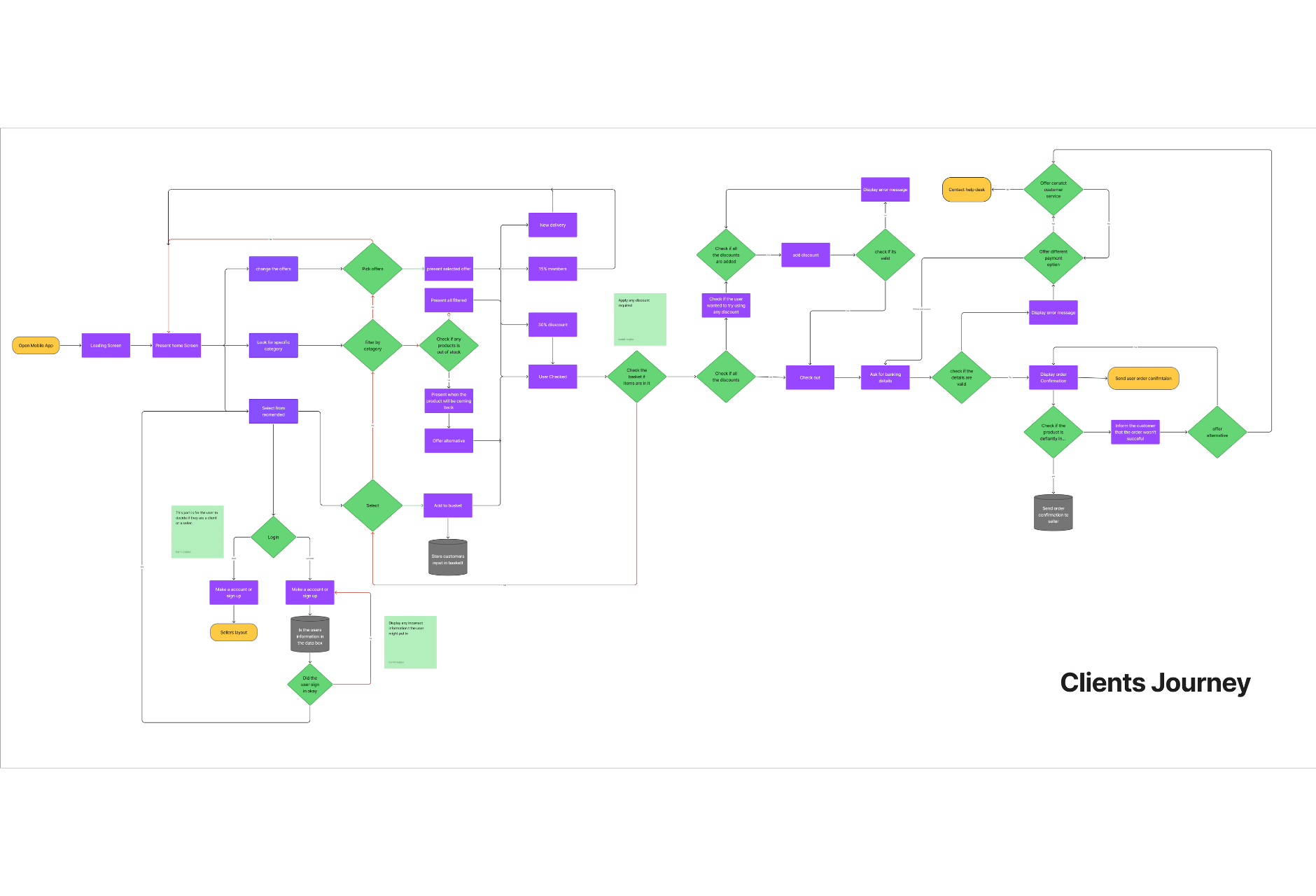
My Role
As the lead UX/UI designer and researcher, I was responsible for shaping the app’s user journey, interface design, and overall experience. Drawing on my background in graphic design, I balanced creativity with usability ensuring the visual language reflected both the personality of the brand and the needs of its users. I also conducted competitor research and defined the target audience through user profiling, while collaborating with an illustrator who developed the app’s bespoke graphics and iconography.
%20Infographic%20-%20Green%20Treat%20%20(1).png)
Challenges
One of the biggest challenges was keeping the app simple without compromising on functionality. With multiple user types sellers and buyers we needed to create a seamless experience for both without overwhelming either.
We also faced accessibility issues during testing: the app’s green-heavy interface created difficulty for colour-blind users, particularly with contrast between white text and green backgrounds. Another issue was building seller specific features (like sales tracking and product uploads) without disrupting the buyer flow. Structuring these two user journeys clearly and efficiently took careful planning and testing.
.png)
Solutions
We redesigned the interface with accessibility in mind adjusting contrast ratios, providing flexible background options, and ensuring text remained legible regardless of user vision. Based on user feedback, we introduced a toggle feature to allow sellers to switch between store and buyer views easily. The seller dashboard was also restructured to be intuitive and mobile-friendly, with clear indicators for sales insights, product management, and messaging.
Tools Used
- Figma
- Adobe Illustrator
- Adobe Photoshop
Results
After implementing changes based on early user trials, we saw a significant improvement in app satisfaction scores during later testing phases. Over 85% of testers said the app felt “easier to use” compared to other shopping or ordering apps, and accessibility compliance improved by 40% following the visual updates. The client moved forward with a soft launch strategy, using influencer led content to build interest, and early response from test users has been overwhelmingly positive.
.png)